
You may have noticed that the foam core model in my last post was entirely white. In Elements and Principles, that’s a requirement. We’re learning about form and shape, not about color. In my color theory class, on the other hand, color is, unsurprisingly, the main focus. So my latest model for that class is much more interesting, color-wise.
The assignment was to
Create a model with a color scheme representing a color theory as discussed in class and in your reading assignments. According to the color theory you select, how does your project influence behavior? Use two planes, each 10” square and at least 3, 3-D objects.
We were permitted to use an artist, piece of art, or artistic movement as our color theory. I have my own opinion as to why this was allowed, but I won’t get into that here. I overheard some of my classmates discussing Rococo furniture between classes, and that reminded me of a particular painting I like from the Rococo period by Jean-Honore Fragonard called “The Swing.”

In addition to drawing from the colors in this painting (pink and green, a complementary color scheme), I also tried to use the curving forms common in Rococo art and design. This is what I came up with:
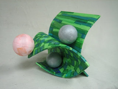
While I was working on this during studio time, the instructor pointed out that the colors are colors that I wear often and asked if the color theory was based on the theories of Johannes Itten. Itten was an artist and theorist associated with the Bauhaus school. He was the first to associate four distinct color palettes with certain types of people, now known as seasonal color analysis. His research indicated that people would tend to paint the colors that they are. You may be familiar with more recent popular works on the subject such as Color Me a Seasonor Color Me Beautiful.
Back to the point, my instructor’s comments made me think that there really is something to Itten’s work, and that I was drawn to The Swing and chose to use those particular colors because they are my colors. I thought it was interesting.
© 2010 The Beehive All Rights Reserved
Erin, I’m finding this all very fascinating. What were the materials used in this project? Did you color and texturize them? Such a modern interpretation of form. Very, very interesting . . . and you do such a nice job – both in the designs and in the explanations.
Hi Tammy,
In this project, the curved planes are made of foam core, which I scored for the curved effect and covered with Bristol board to hold the curve. The spheres are just styrofoam from the kids project section at Michael’s (like for building a solar system). Both foam core and Bristol are white, so the color and texture is just tissue paper decoupaged on the outside, which I know you’ve also used for one of the art pieces in your guest room ;).